
.svg)
Before we began redesigning everything, we had to first identify what the problem is. We began by identifying our research goals.
Each team member individually conducted a heuristic evaluation on the existing MSU Library homepage. The team chose this method because it provided an internal method of identifying usability issues. In identifying existing usability issues, the team made design decisions that eliminated these issues, making a more seamless experience for users. The team found 8 commonly mentioned site features that violated various heuristics.
Using the 8 site features identified during heuristic evaluation, the team ranked each comparators' site on a scale of 1-4. The evaluation showed the University of Michigan's library site having the most successful implementation of key features (top ranking in 5/8 categories) with Harvard University being most successful in the remaining 3/8 categories.
In order to understand how users interacted with the library homepage, we conducted a comparative usability testing on MSU and Penn State. During comparative analysis, we found that the Penn State Library site had a very different design so we decided to compare them to gain insights on users' experiences with both websites. This helped us identify design patterns.

The team decided that Google Analytics data didn't provide everything we needed to learn about our users, so we sent out surveys to students. The survey questions yielded more qualitative data, as we were able to capture a higher volume of responses with less time and effort costs on our end. This data helped us discover usage patterns of library sites, common user preferences, annoyances, and rankings.


Based on the survey results, we wanted to focus on (a). making the homepage more visually appealing by reducing the amount of text, (b). using more visual hierarchy, (c). using colors sparingly, and (d). adding more images to make the homepage more aesthetically pleasing. Since students' main motivation for using the library website is to use the search bar, the homepage should help students efficiently search the library catalog. We needed a catalog search that is more prominent and stand out from rest of the content, while ensuring that we reduce the amount of information shown to users all at once so that users can easily scan for informaiton.


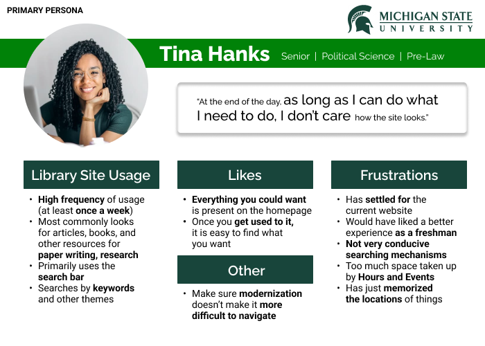
We knew who our target users were, but we didn't have a problem that we were solving for. Our initial goals were as simple as improving the usability of the site as MSU gets ready to update their content management system. All the research done before was to help the team understand our users, validate our assumptions about issues, and defining industry standards. We created personas and journey maps to put all this together.

.png)


Based on all of our findings shown above, we defined a list of requirements to focus for improvement and redesign.


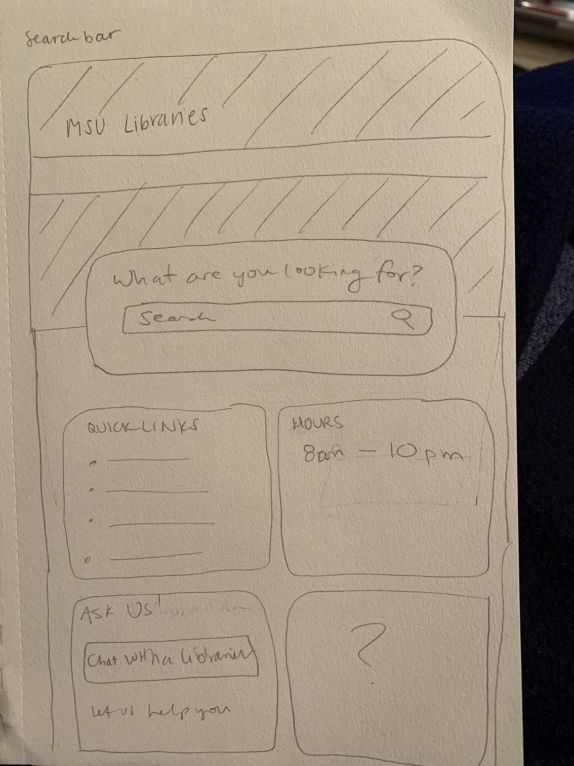


The first round of iterative design began with sketches based on ux requirements. These sketches were focused on the layout of all the items and section architecture with inspiration from key elements identified from comparative analysis.
The next step was to create screens with the addition of more details and visual elements to prepare for preference testing with users. We conducted preference testing with our clients and students from the University of Michigan and came up with two high fidelity prototypes. Preference testing was chosen instead of usability testing because the project's scope was to improve visual appeal, information hierarchy, and overall brand cohesiveness.
A second round of preference testing was conducted after merging each designs into two hi-fi prototypes. We analyzed all the feedback received and produced specific design recommendations to apply for our final design. Similar to the previous preference test, the team kept questions very open ended so that users could freely express what they see and how they felt.
.png)
.png)
To validate our final design and gain client buy-in, the team collected quantitative data to measure the project success. We asked our users to rate on a scale for the existing homepage vs the redesigned homepage. Then, we asked users to rate each design based on provided metrics (e.g., What search bar gives you a clearer idea of what you can use it for?). Based on these data, the team feels confident in saying that the redesign is successful in meeting the needs, goals, and expectations of the client and the MSU community.


